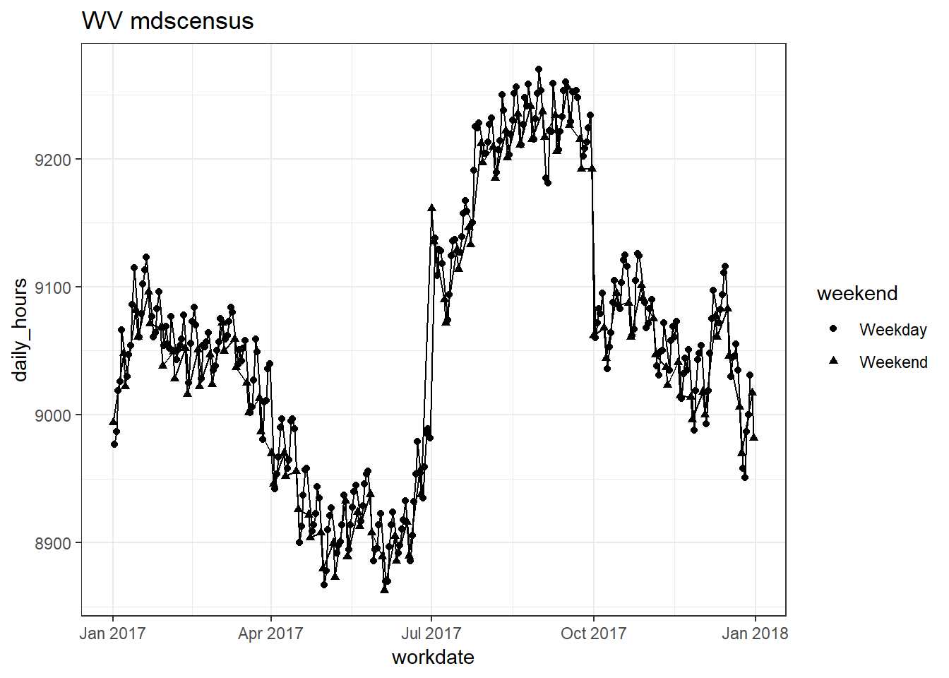
Plotting and visualizing data are two of the most helpful and common activities for data analysts/scientists/whatevers. When I first started learning R, I would generate each plot individually, sometimes using a lot of copy-paste. This was fine in school, but it became much too time consuming and painful when I started working full-time.
The difficulties I’ve encountered are often of the sort where I need to generate a bunch of similar looking plots. For instance, two common scenarios are trying to get a feel for a new data set I’m working with or trying to diagnose issues in the data processing pipeline. This post is going to demonstrate two ways I like to generate plots using 2017 nursing home staffing data from data.cms.gov.
CMS produces data sets of daily staffing data for (more or less) every nursing home in the US on a quarterly basis called the “Payroll Based Journal”. The data are freely available to the public. I’ve already downloaded the 4 quarters worth of data from data.cms.gov and combined them into a single data set called pbj_df.
The first thing I want to do is examine the data set.
glimpse(pbj_df)## Observations: 5,159,102
## Variables: 10
## $ provnum <chr> "015012", "015012", "015012", "015012", "015012"...
## $ state <chr> "AL", "AL", "AL", "AL", "AL", "AL", "AL", "AL", ...
## $ workdate <dbl> 20170701, 20170702, 20170703, 20170704, 20170705...
## $ mdscensus <dbl> 48, 48, 47, 47, 47, 45, 45, 44, 43, 45, 47, 46, ...
## $ hrs_rn <dbl> 21.06, 21.27, 21.80, 8.73, 0.00, 12.28, 0.00, 22...
## $ hrs_rndon <dbl> 0, 0, 8, 8, 8, 8, 8, 0, 8, 16, 16, 8, 8, 8, 0, 0...
## $ hrs_rnadmin <dbl> 1.23, 0.00, 8.50, 5.68, 17.71, 18.86, 19.46, 0.0...
## $ hrs_lpn <dbl> 37.25, 37.84, 38.05, 52.80, 40.07, 25.10, 50.58,...
## $ hrs_lpn_admin <dbl> 0.00, 0.00, 7.85, 0.00, 9.82, 8.63, 10.27, 0.00,...
## $ hrs_na_trn <dbl> 0, 0, 0, 0, 0, 0, 0, 0, 0, 0, 0, 0, 0, 0, 0, 0, ...We see that it contains about 5 million rows and 10 columns. The data contains a single observation for each day of 2017 for each nursing home. For my purposes here I’m not interested in individual facilities, so I’m going to generate aggregates for each labor category, day, and state. I can do that easily with a couple tidyverse functions. (I’m only going to do a subset of 5 states because it’s overkill to produce over 150 plots.)
The gather function stacks all the labor category hour values into one column (called hours), with another another column (called category) that tells me which labor category those values belong too. This type of data set structure is often called a “long data set”. It’s important to have the data in this form because I want do processing by groups of data and I can not use the category variable as a group. I also create a new variable called “weekend”, that tells me whether the workdate falls on the weekend.
daily_df <-
  pbj_df %>%
  mutate(workdate = as.Date(as.character(workdate),
                            format = "%Y%m%d",
                            origin = "2017-01-01")) %>%
  gather(-provnum,-workdate,-state,
         key = category, value = hours) %>%
  group_by(category, state, workdate) %>%
  summarize(daily_hours = sum(hours)) %>%
  mutate(weekend = case_when(
    wday(workdate) %in% c(1,7) ~ "Weekend",
    TRUE ~ "Weekday"
  )) %>%
  filter(state %in% c("AR","AK","AL","MA","WV"))

glimpse(daily_df)
## Observations: 12,775
## Variables: 5
## Groups: category, state [35]
## $ category <chr> "hrs_lpn", "hrs_lpn", "hrs_lpn", "hrs_lpn", "hrs_l...
## $ state <chr> "AK", "AK", "AK", "AK", "AK", "AK", "AK", "AK", "A...
## $ workdate <date> 2017-01-01, 2017-01-02, 2017-01-03, 2017-01-04, 2...
## $ daily_hours <dbl> 329.74, 326.81, 331.56, 307.94, 315.16, 306.59, 32...
## $ weekend <chr> "Weekend", "Weekday", "Weekday", "Weekday", "Weekd...Option 1
Now that I have my data aggregated, I can begin plotting. The first method that can be used to generate a lot of plots is to group the data and then use the nest() function. This creates subsets the data based on the grouping variables. These can then be passed as arguments to a function that generates a plot of each subset of data. If this is done within dplyr’s mutate, then each plot can be stored in a list column which can be referenced later (though this is not necessary). The code below does this for the CMS staffing data.
#Plots using nest()
plots_df <-
  daily_df  %>%
  group_by(category, state) %>%
  nest() %>%
  mutate(line_plot = pmap(list(data,category,state), function(x, y, z) {
    x %>%
      ggplot(aes(x = workdate, y = daily_hours, shape = weekend)) +
      geom_point() +
      geom_line() +
      ggtitle(paste0(z, " ", y))
  }))

plots_df
## # A tibble: 35 x 4
## category state data line_plot
## <chr> <chr> <list> <list>
## 1 hrs_lpn AK <tibble [365 x 3]> <S3: gg>
## 2 hrs_lpn AL <tibble [365 x 3]> <S3: gg>
## 3 hrs_lpn AR <tibble [365 x 3]> <S3: gg>
## 4 hrs_lpn MA <tibble [365 x 3]> <S3: gg>
## 5 hrs_lpn WV <tibble [365 x 3]> <S3: gg>
## 6 hrs_lpn_admin AK <tibble [365 x 3]> <S3: gg>
## 7 hrs_lpn_admin AL <tibble [365 x 3]> <S3: gg>
## 8 hrs_lpn_admin AR <tibble [365 x 3]> <S3: gg>
## 9 hrs_lpn_admin MA <tibble [365 x 3]> <S3: gg>
## 10 hrs_lpn_admin WV <tibble [365 x 3]> <S3: gg>
## # ... with 25 more rowsOption 2
A related but separate way of generating the same plots is to create a dataframe of arguments that are then passed to the plotting function. The plotting function in this case will filter the data set based on the arguments. This bypasses the need to use nest(). I also use the purrr function walk, which produces behavior (prints the plots) but does not return anything.
#Plot using walk()
args <- expand(daily_df, category, state)

walk2(args$category,args$state, function(x,y) {
  plot <-
    daily_df %>%
    filter(category == x & state == y) %>%
    ggplot(aes(x = workdate, y = daily_hours, shape = weekend)) +
    geom_point() +
    geom_line() +
    ggtitle(paste0(y, " ",x))
  print(plot)
  })
I don’t have a strong preference for either of these options. The second is a little more simple in my mind, since it’s essentially a fancy for loop. The plots from option 1 are produced below.
plots_df$line_plot## [[1]]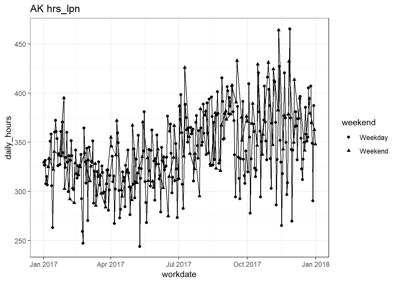
##
## [[2]]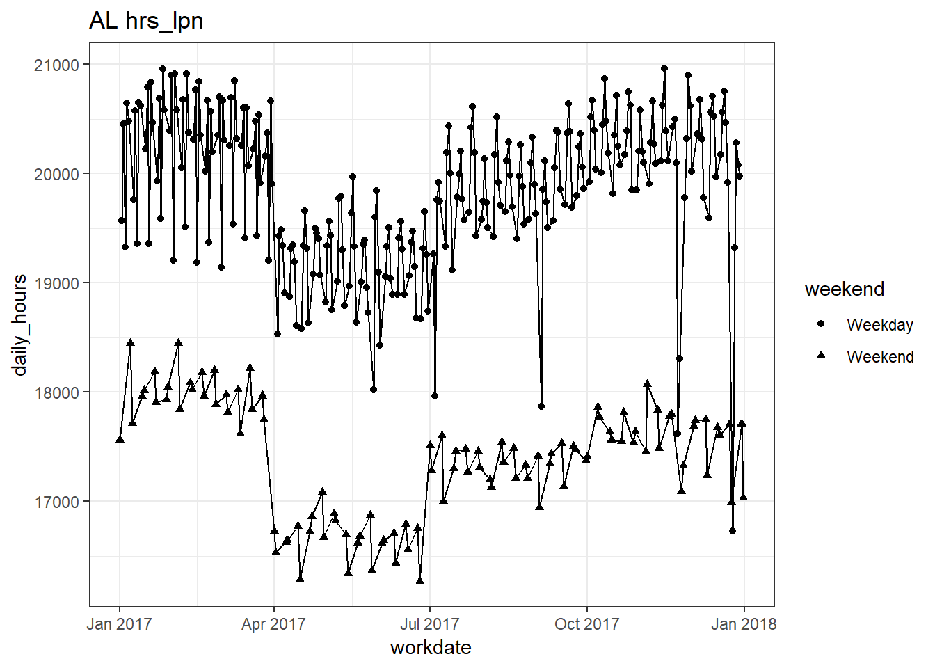
##
## [[3]]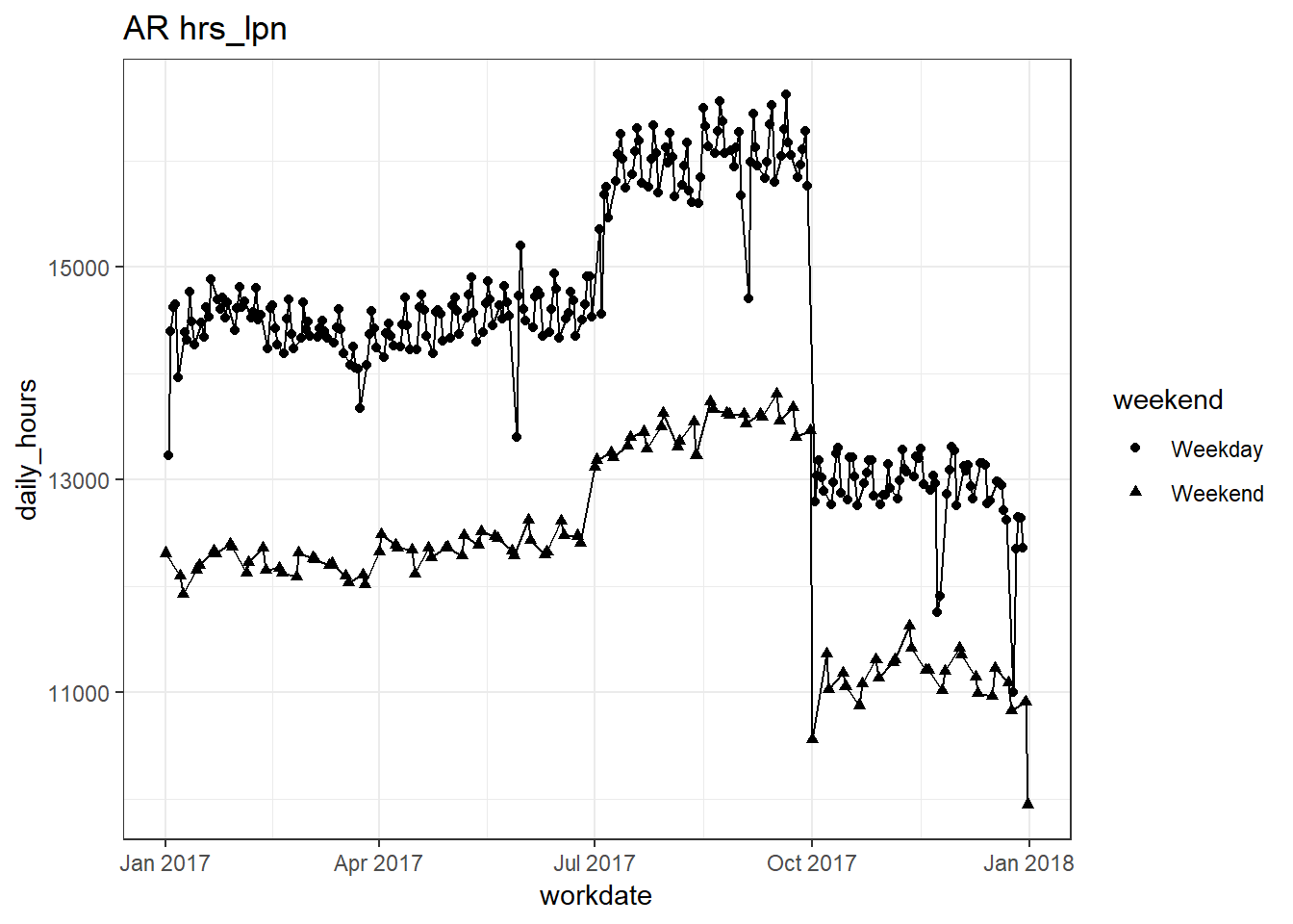
##
## [[4]]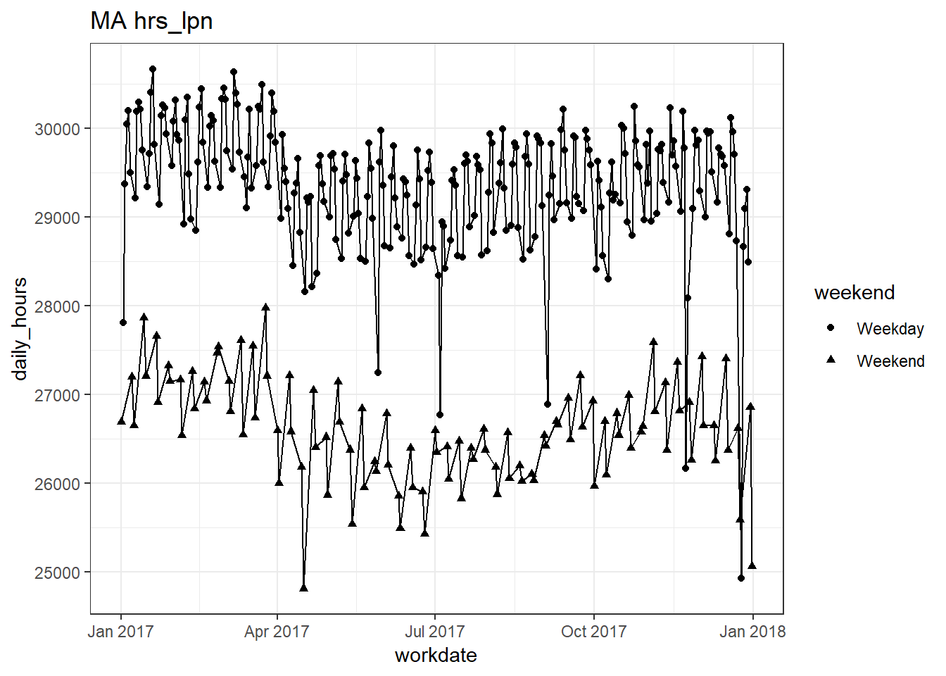
##
## [[5]]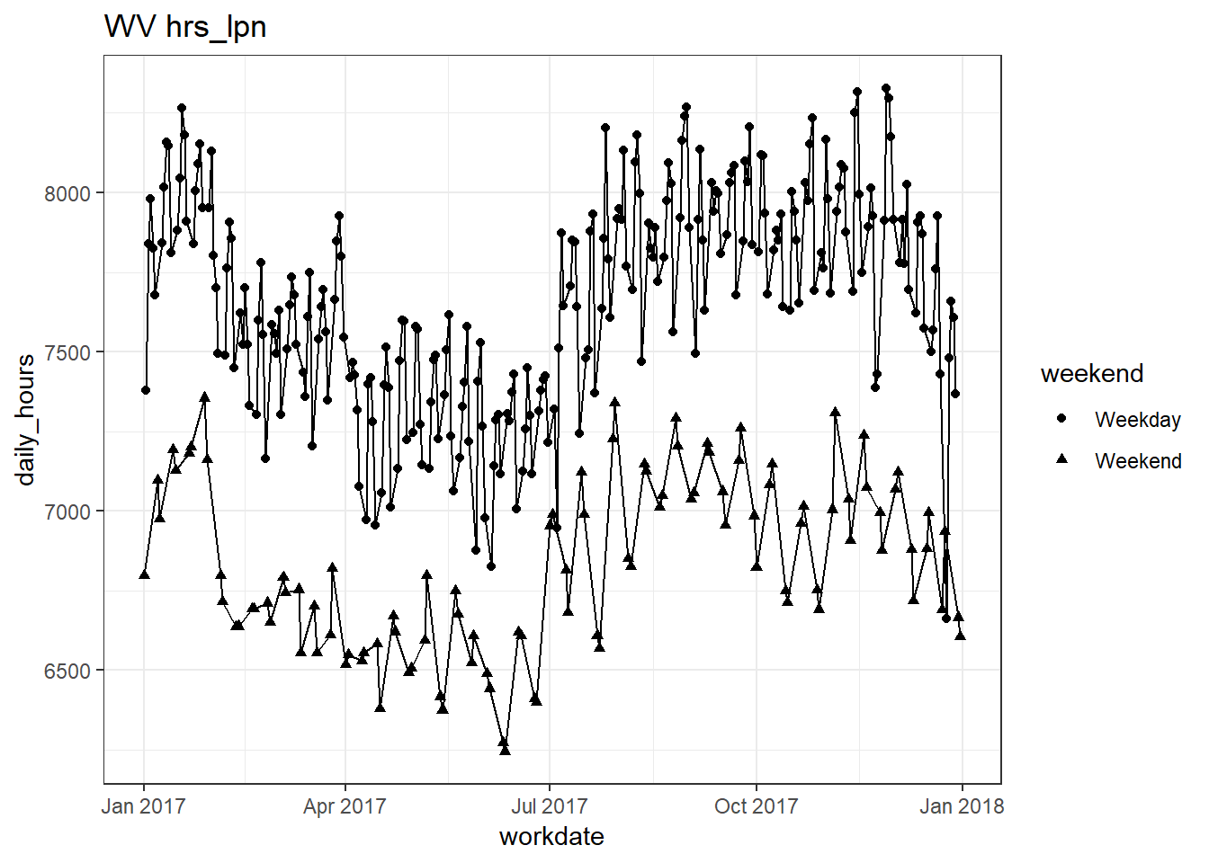
##
## [[6]]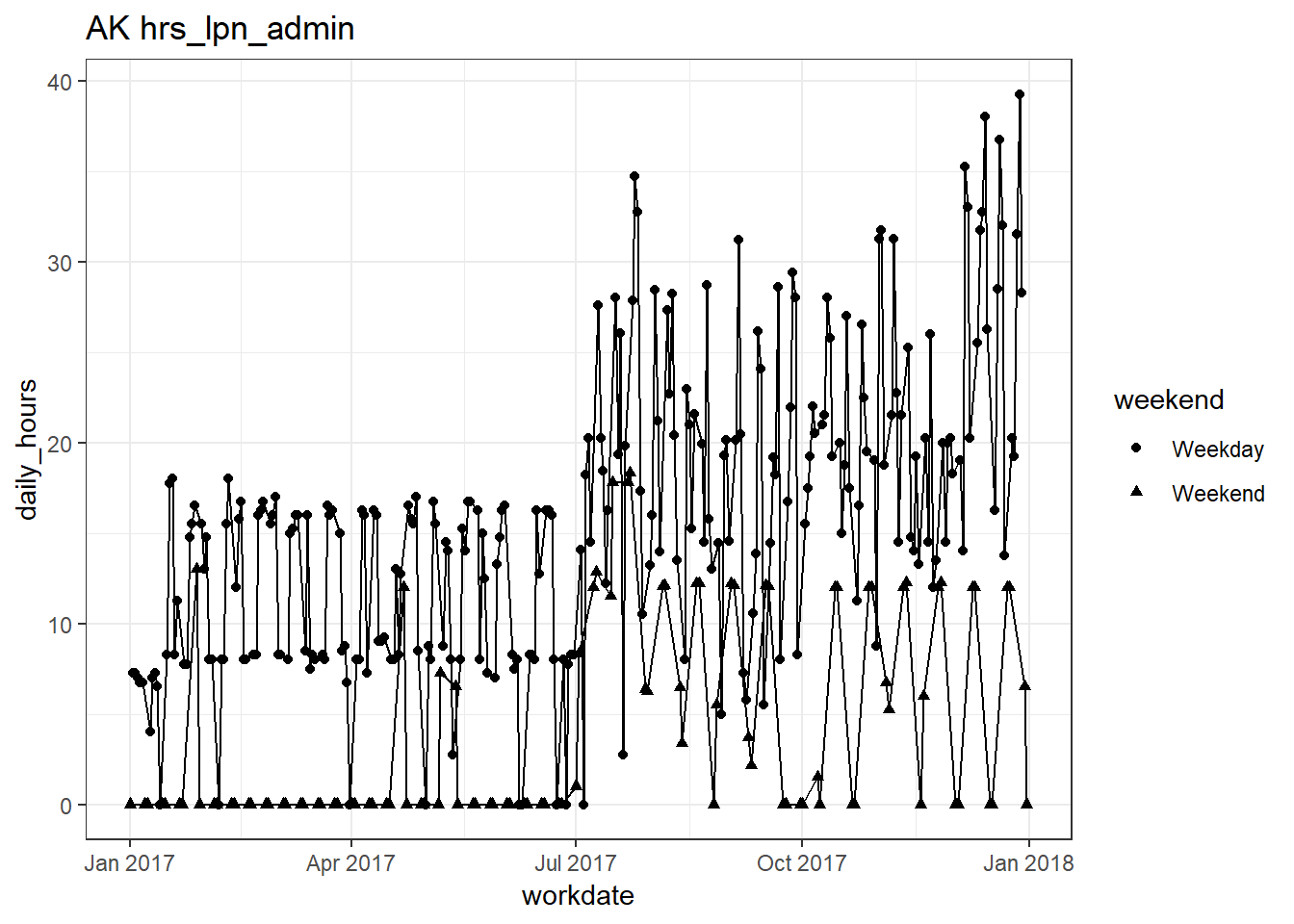
##
## [[7]]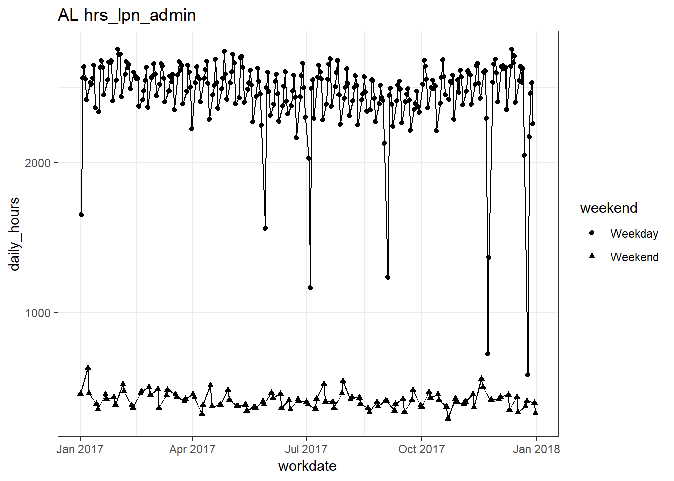
##
## [[8]]
##
## [[9]]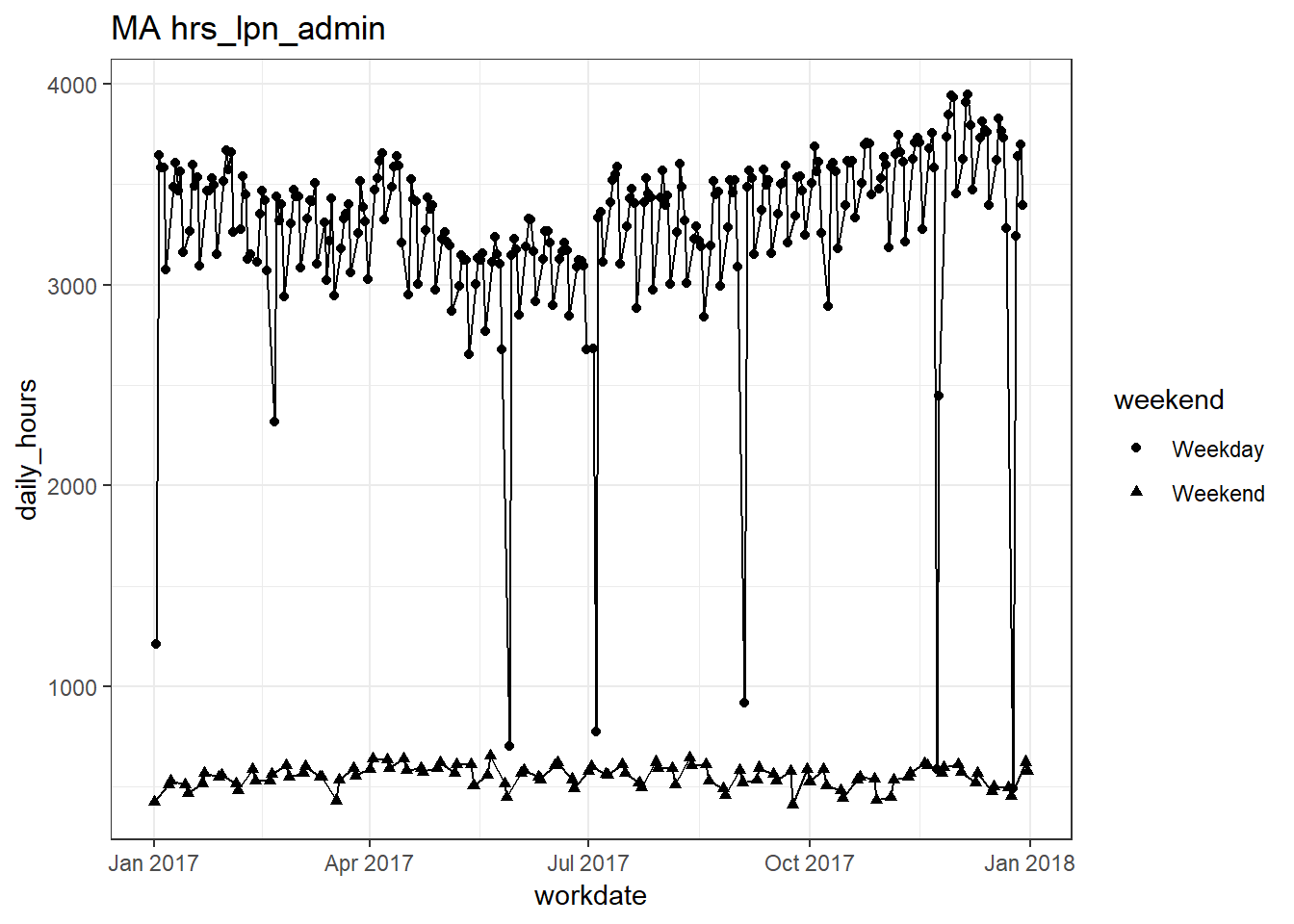
##
## [[10]]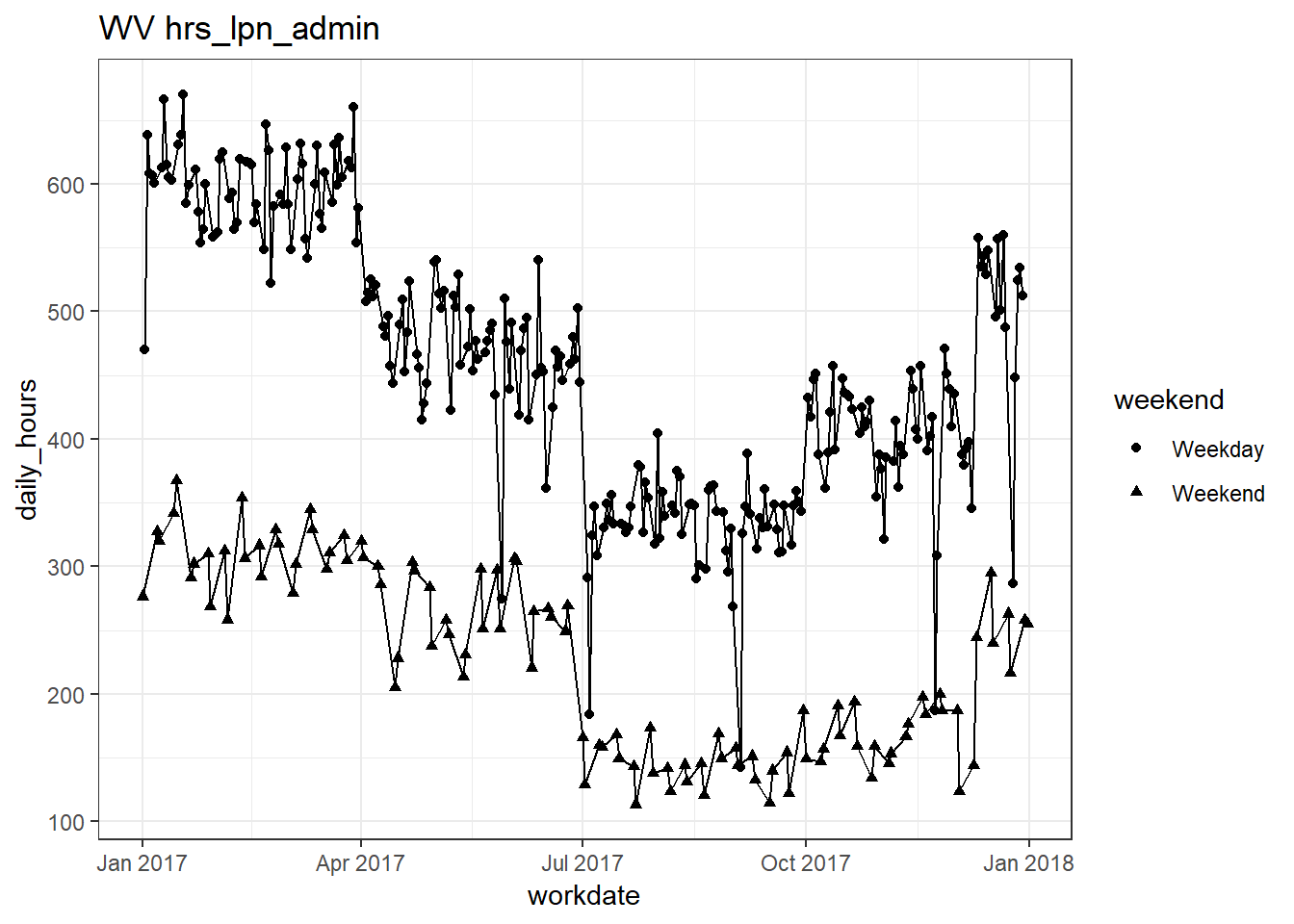
##
## [[11]]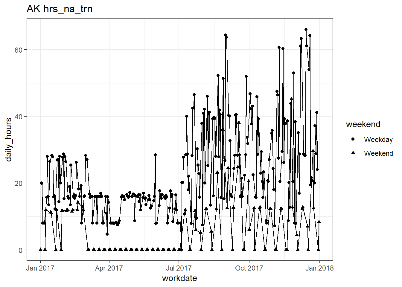
##
## [[12]]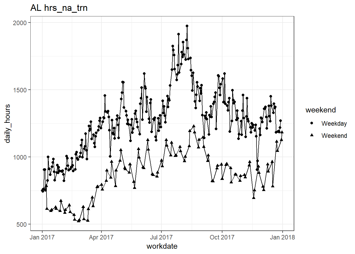
##
## [[13]]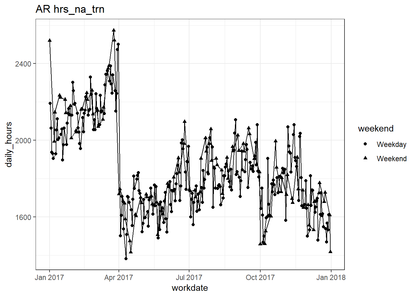
##
## [[14]]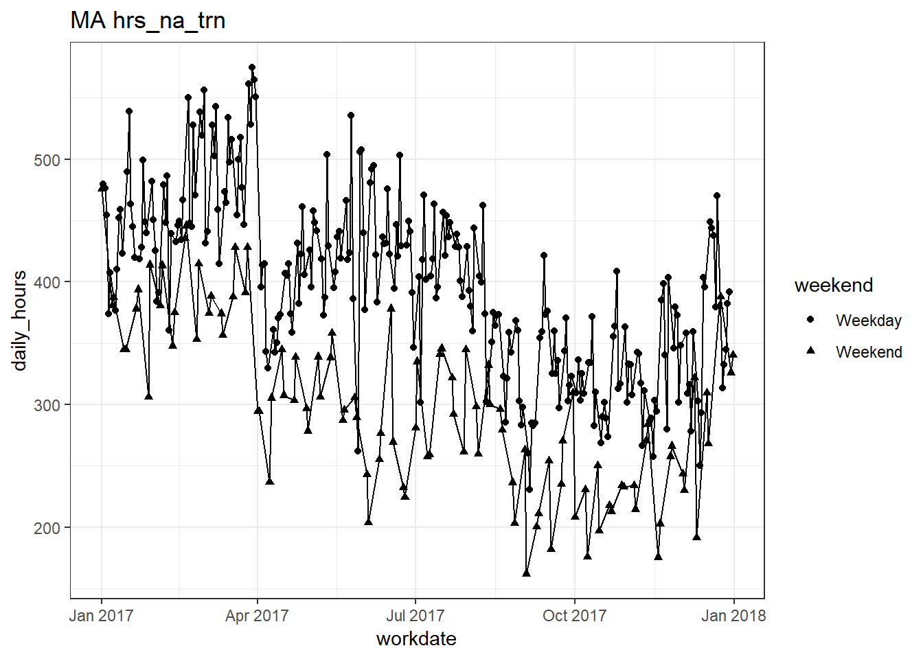
##
## [[15]]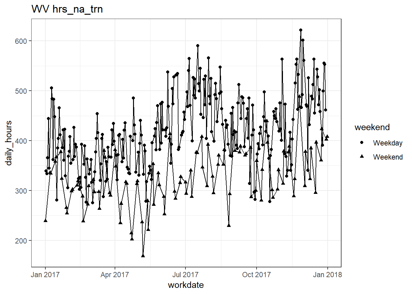
##
## [[16]]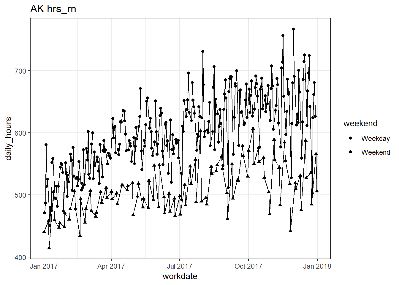
##
## [[17]]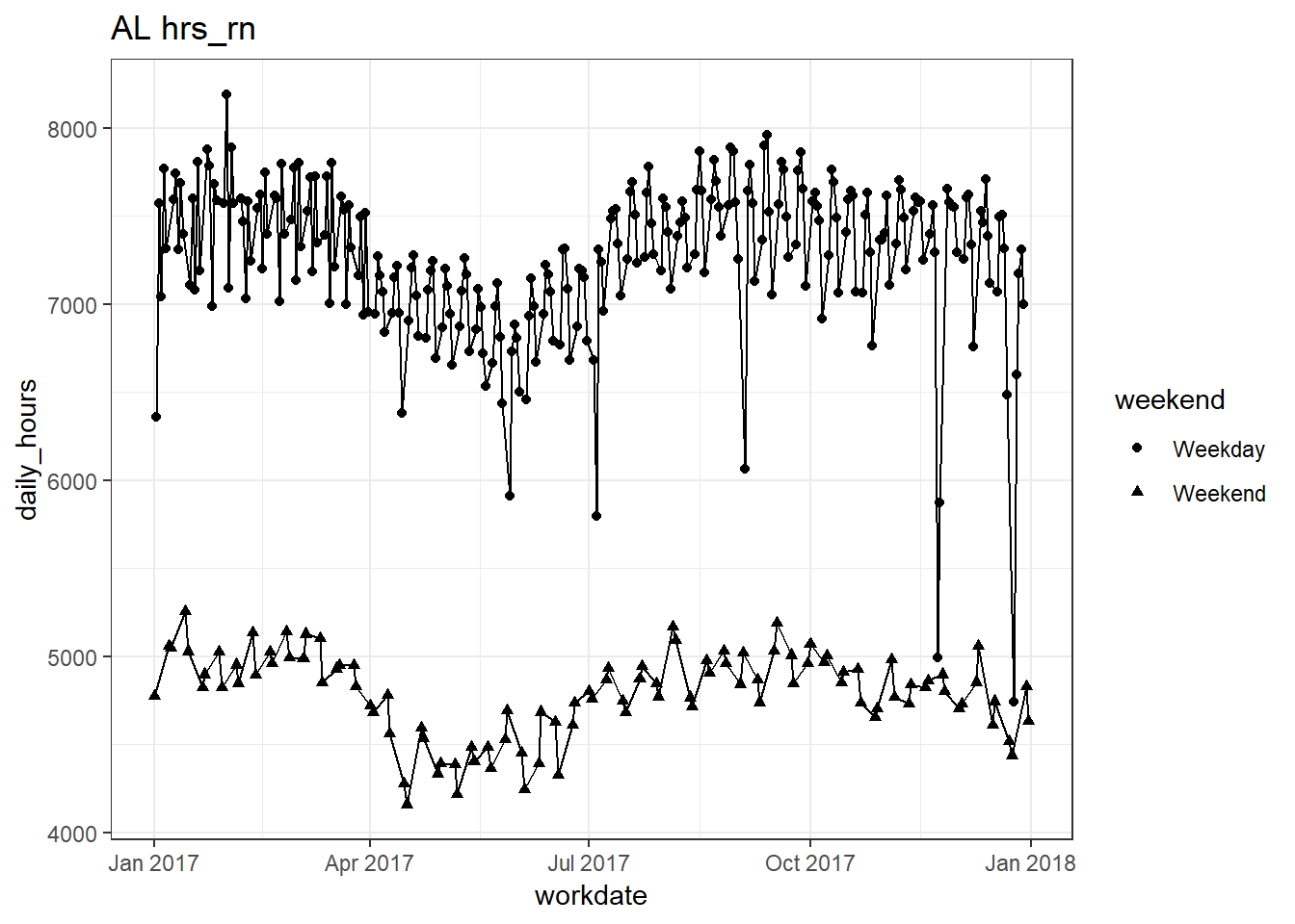
##
## [[18]]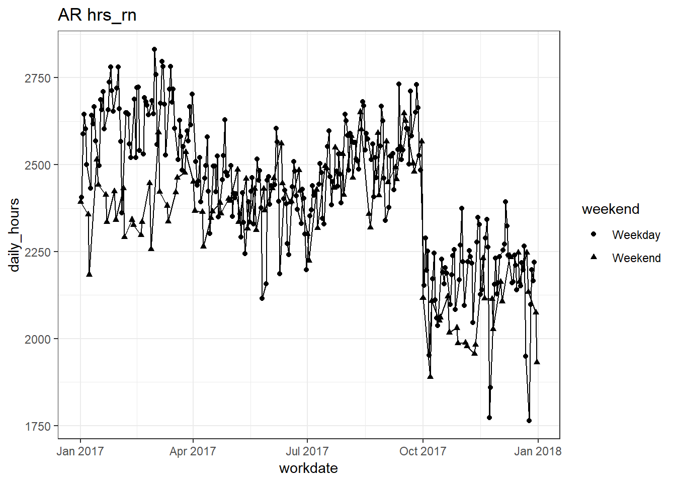
##
## [[19]]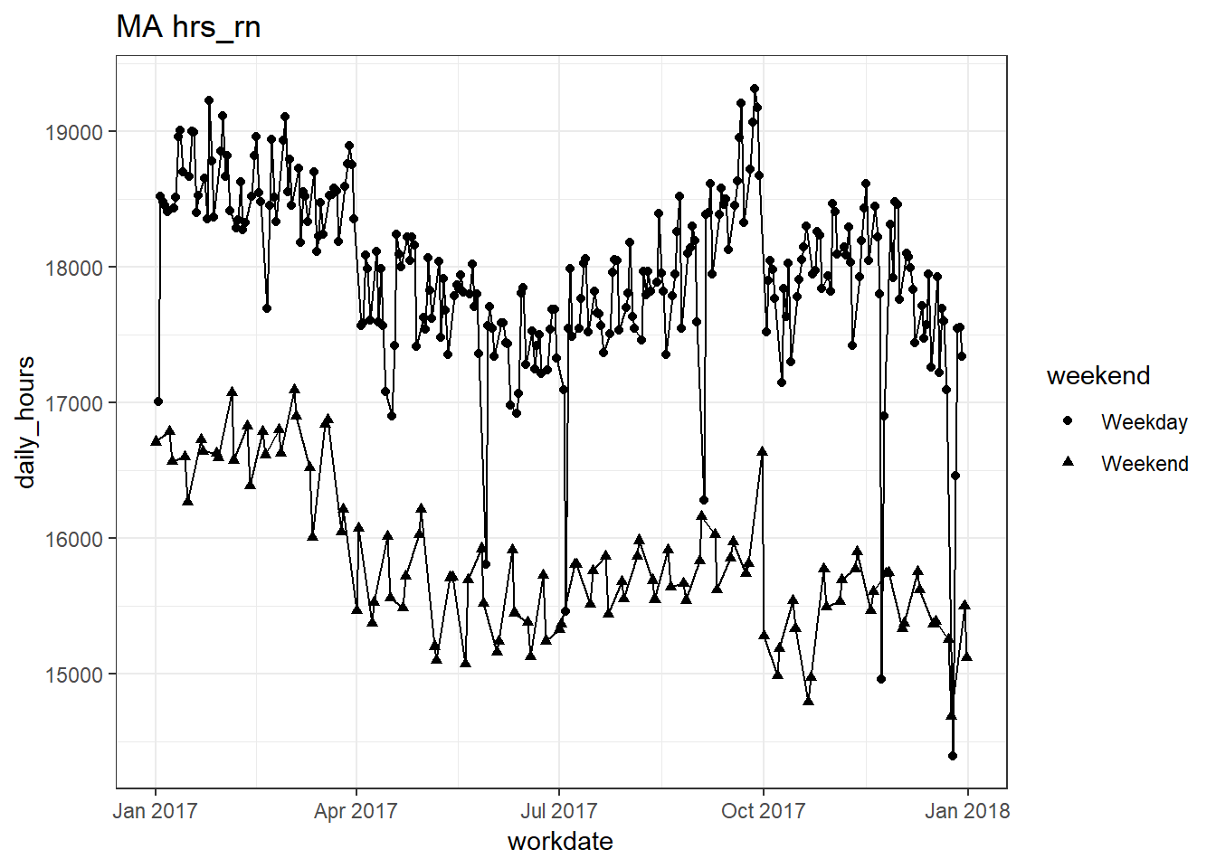
##
## [[20]]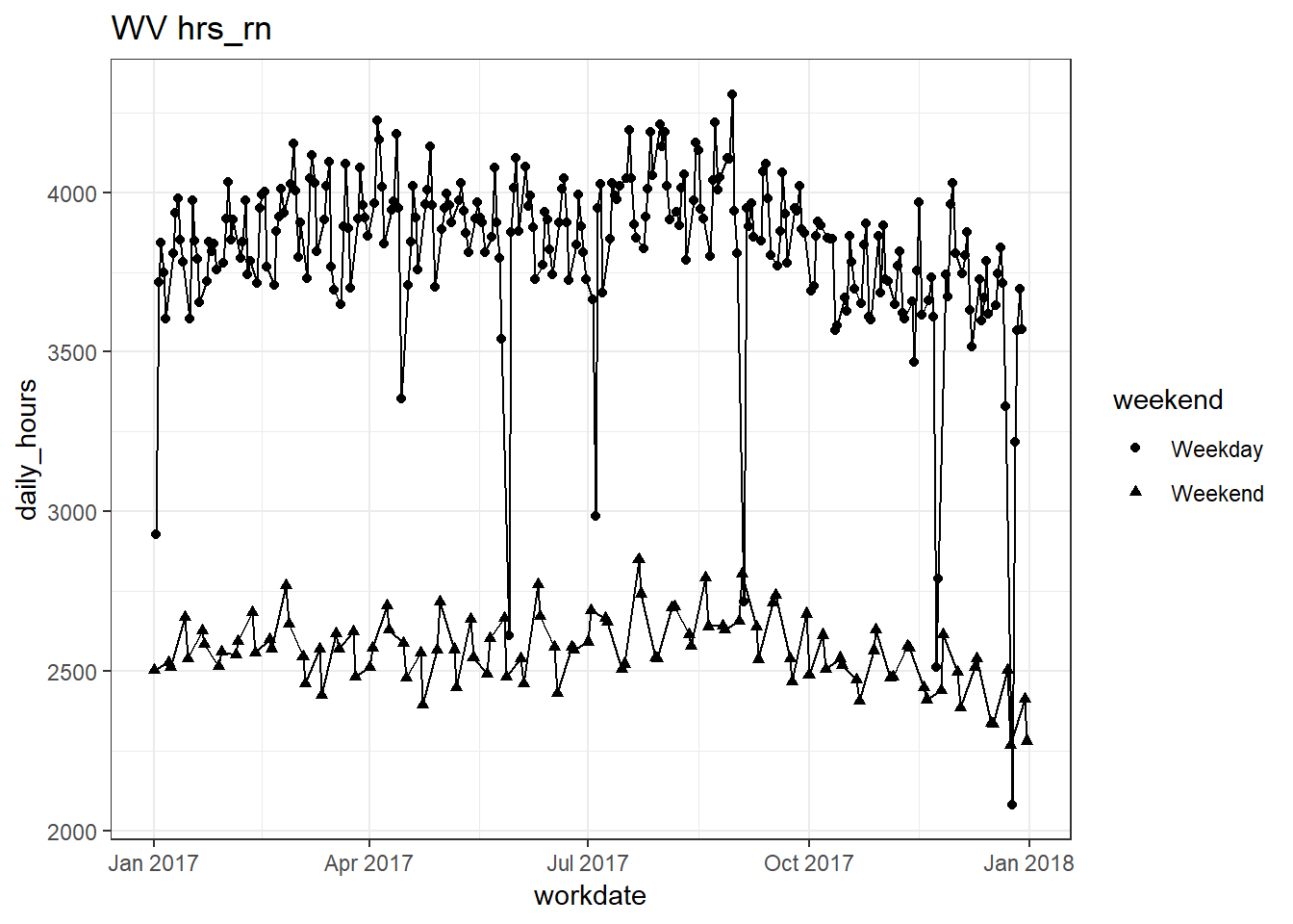
##
## [[21]]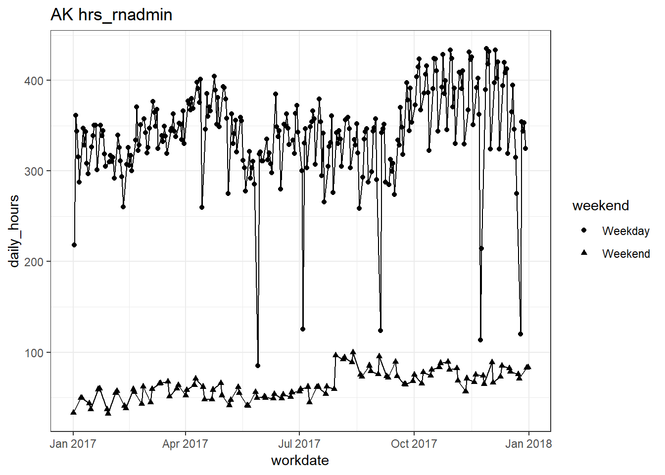
##
## [[22]]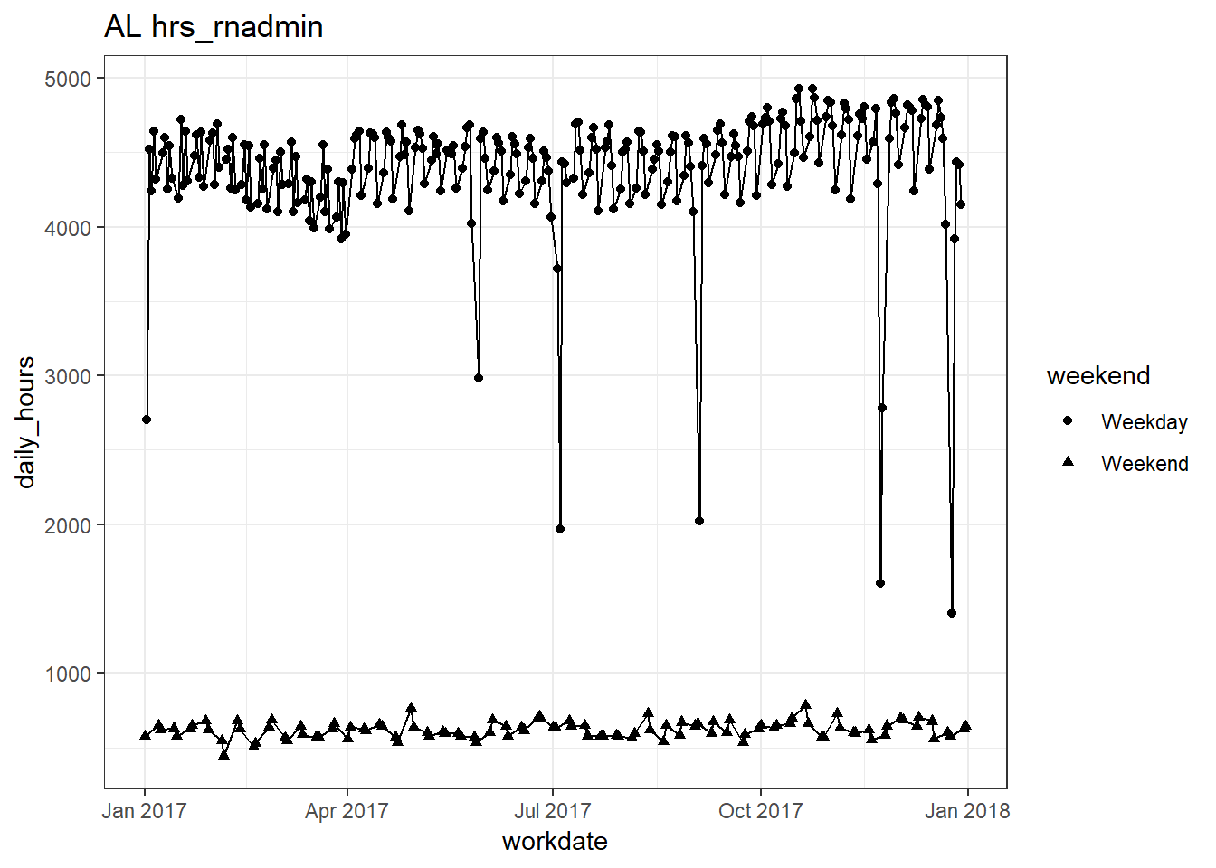
##
## [[23]]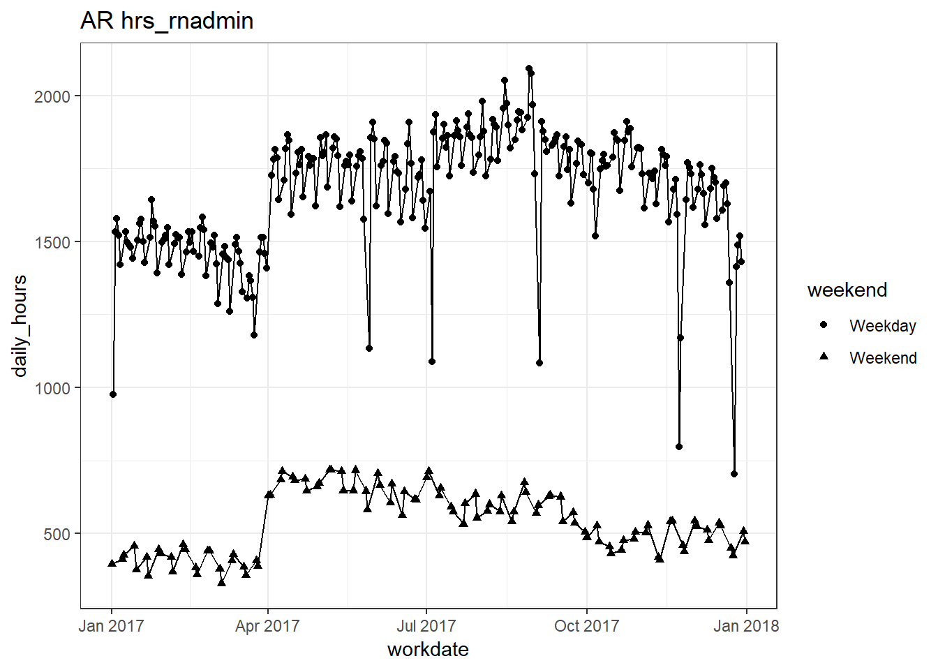
##
## [[24]]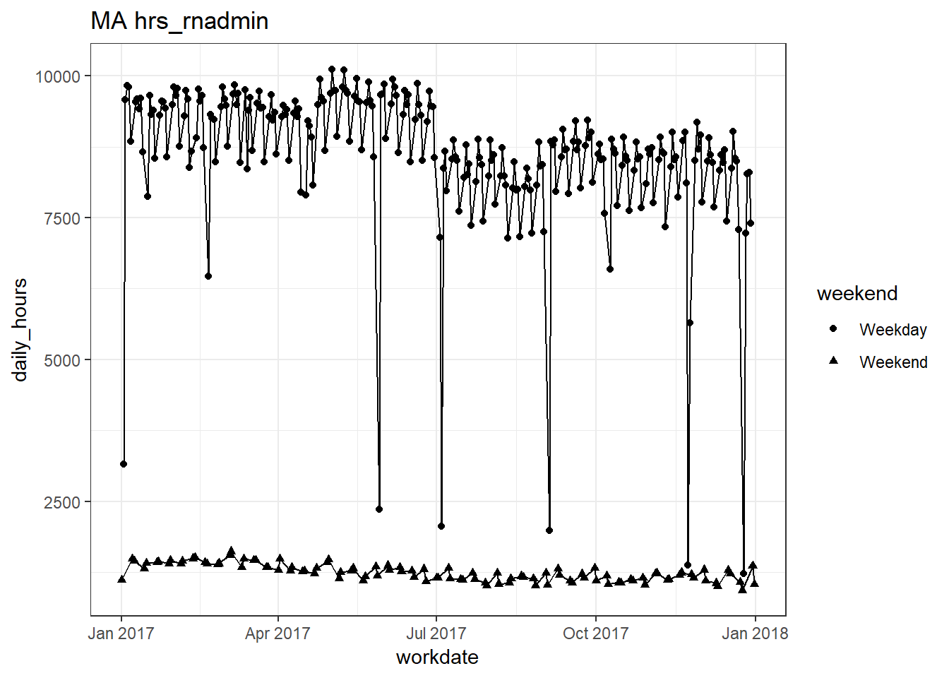
##
## [[25]]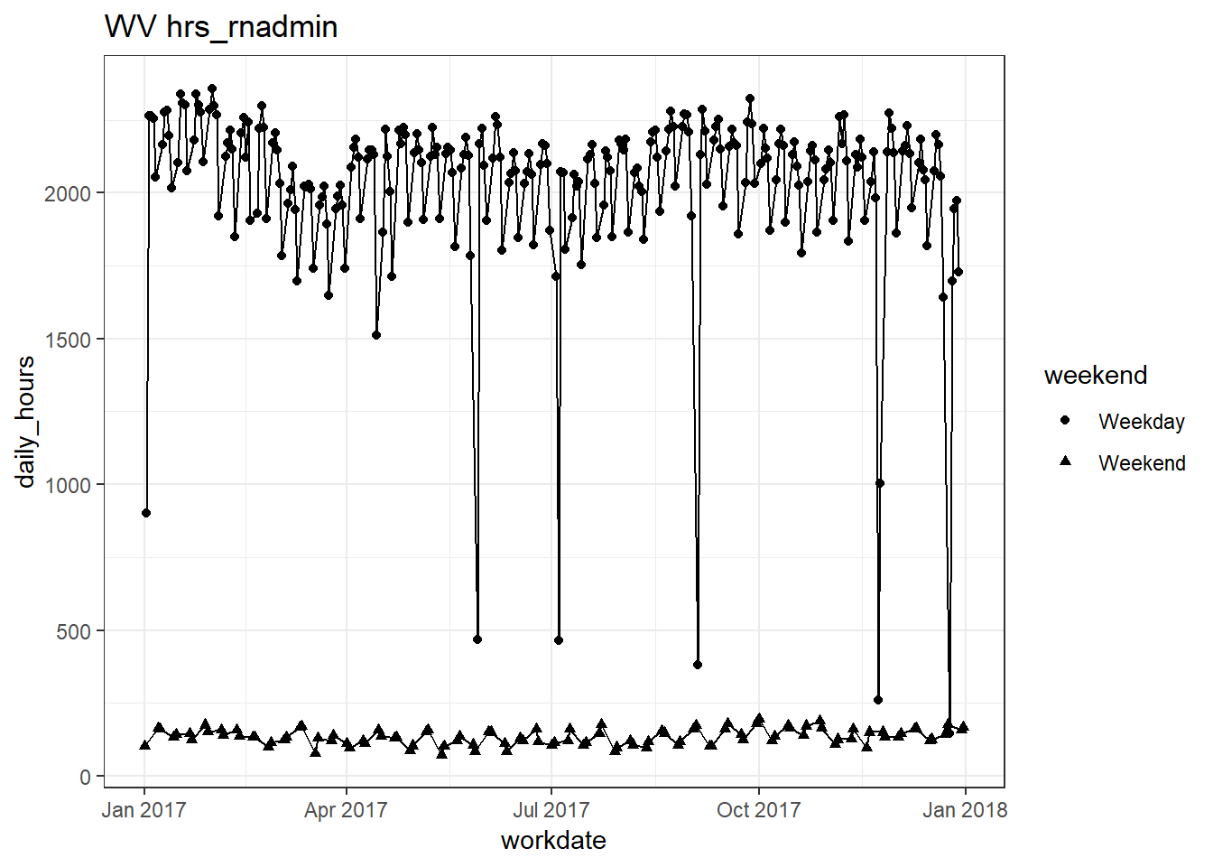
##
## [[26]]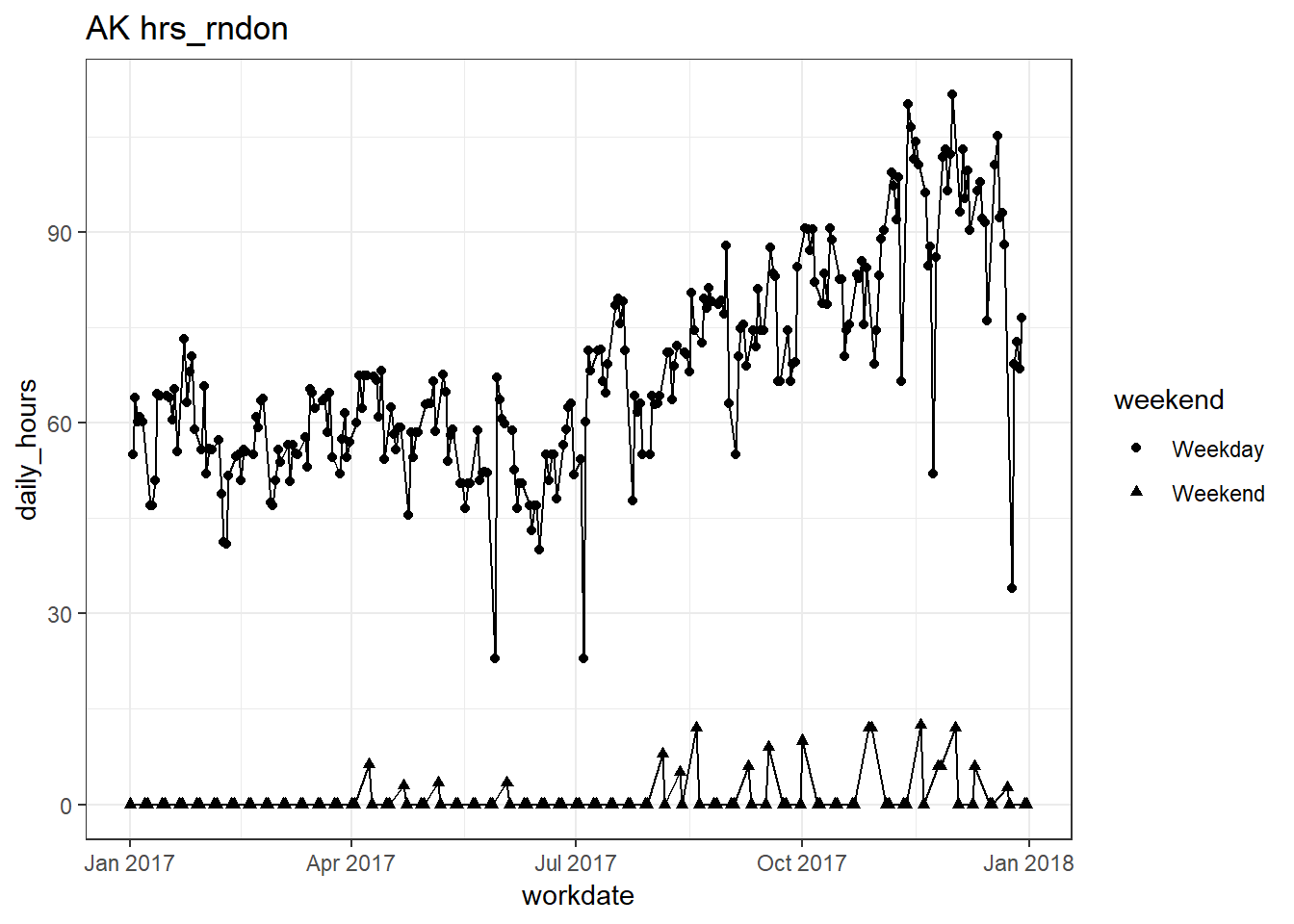
##
## [[27]]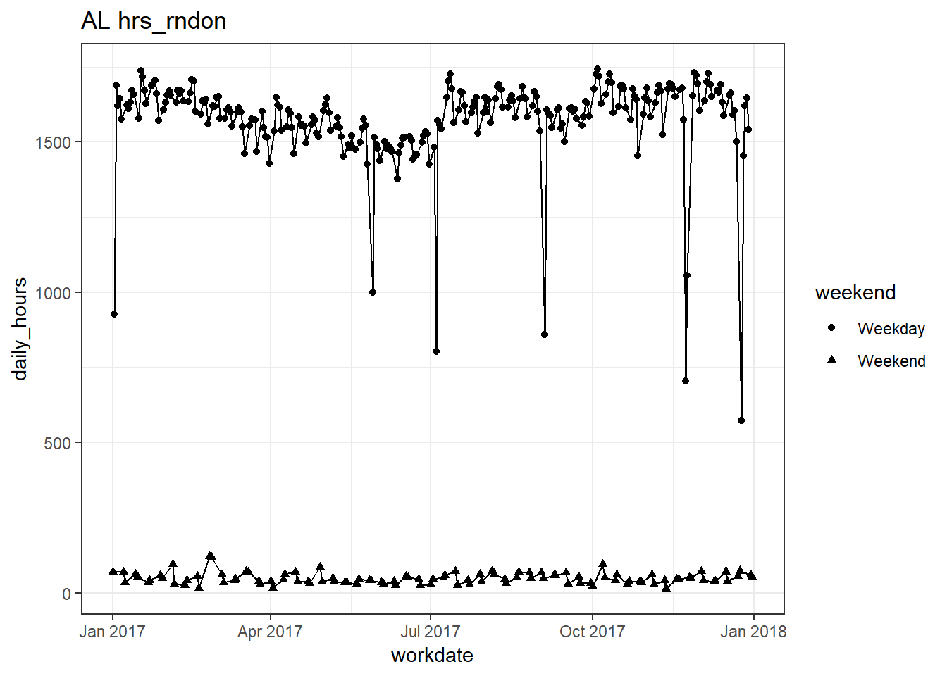
##
## [[28]]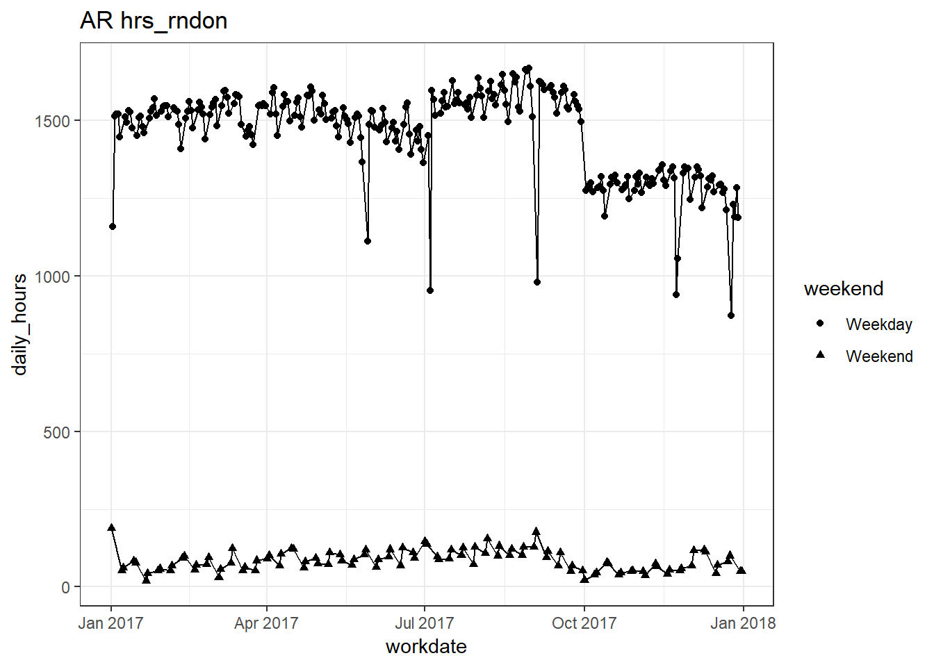
##
## [[29]]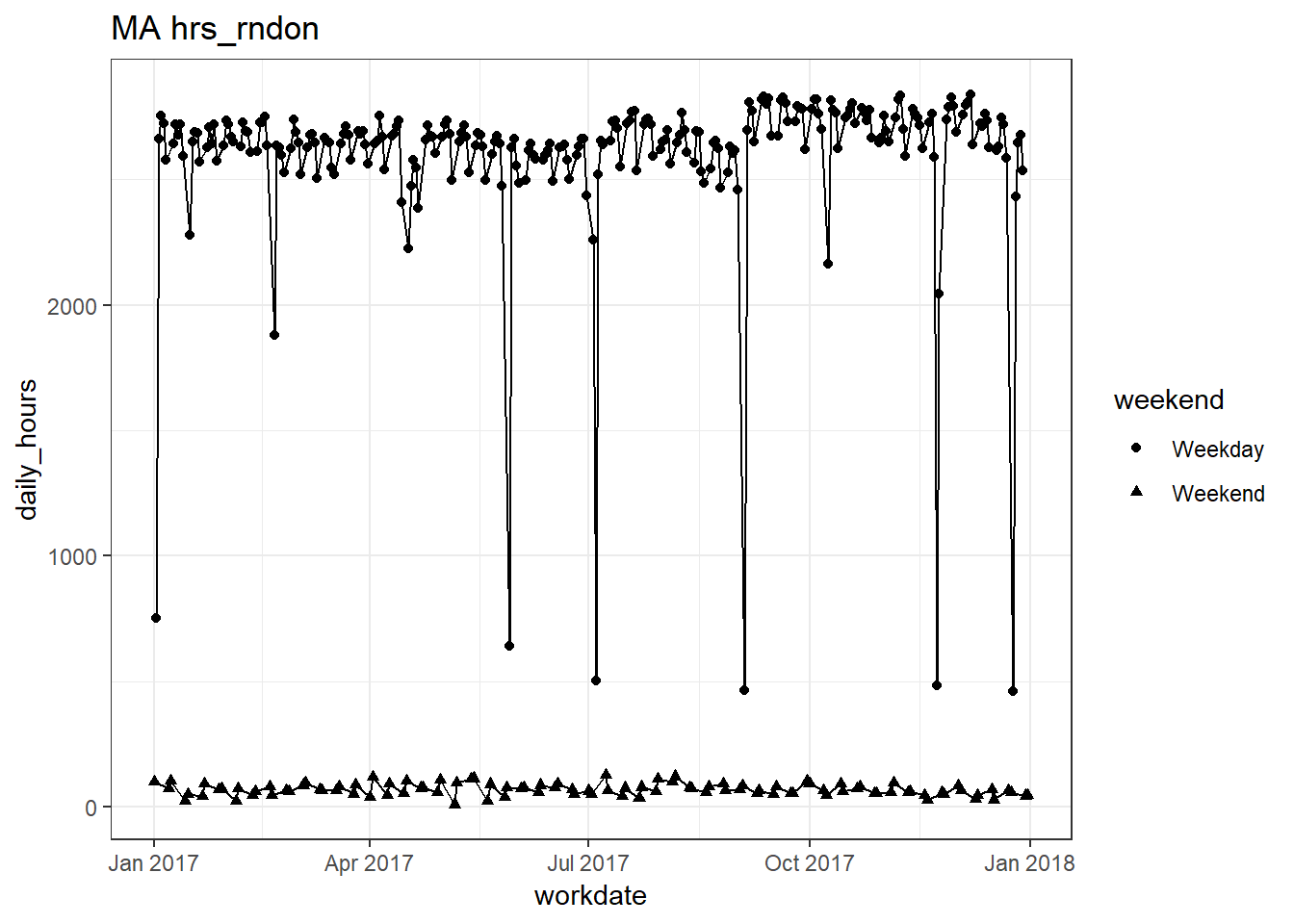
##
## [[30]]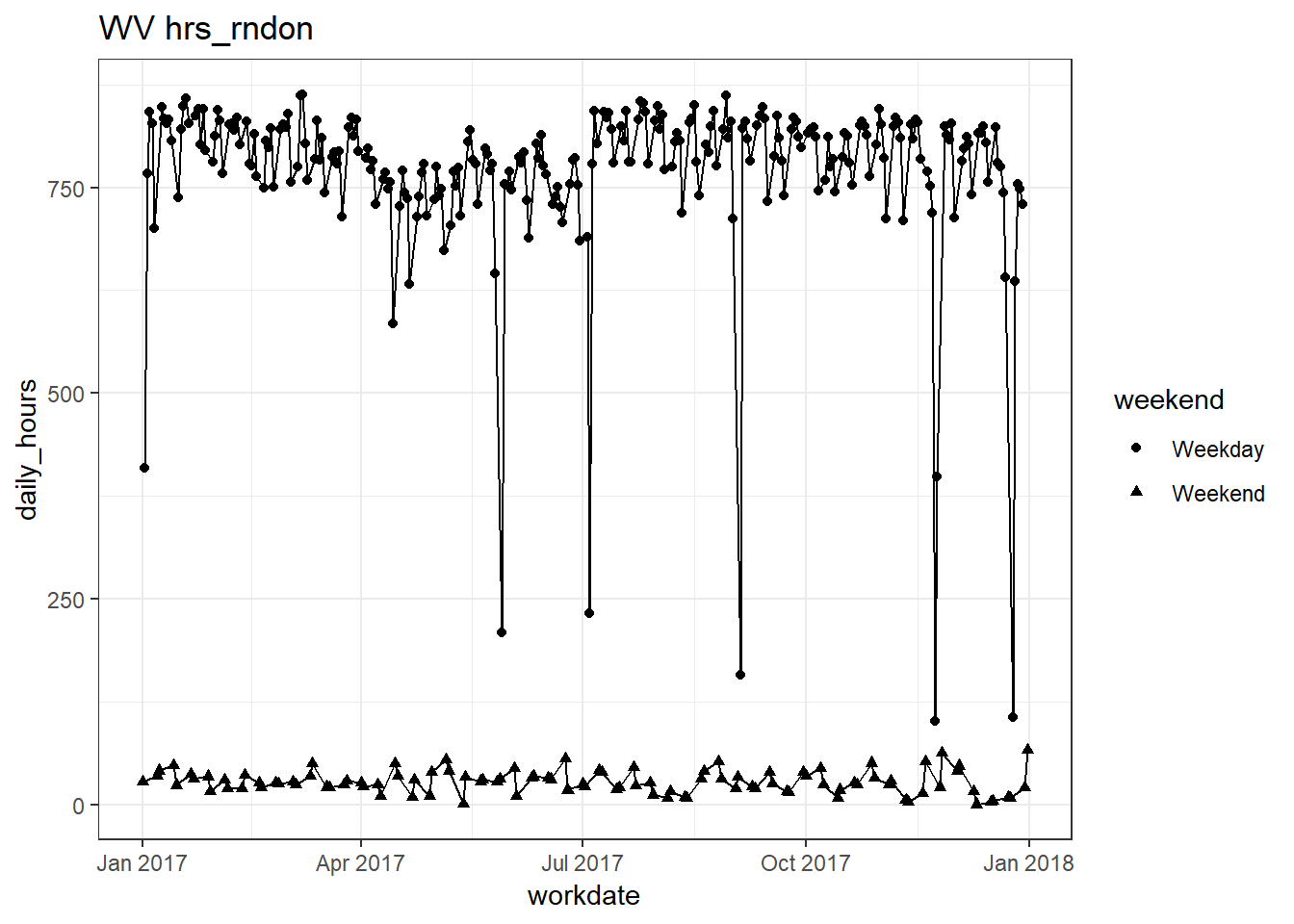
##
## [[31]]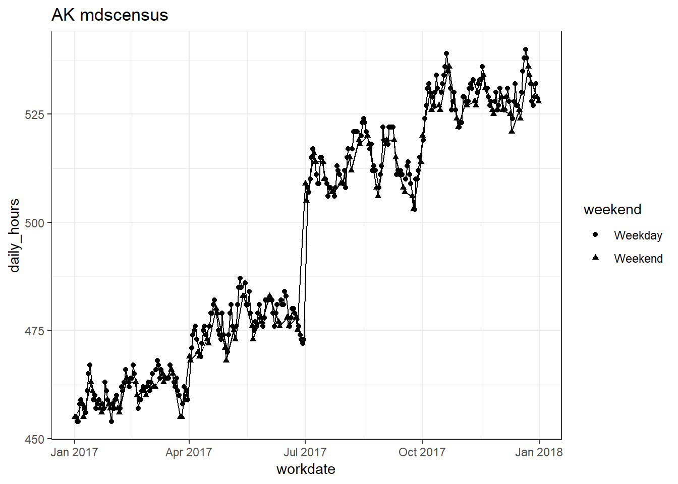
##
## [[32]]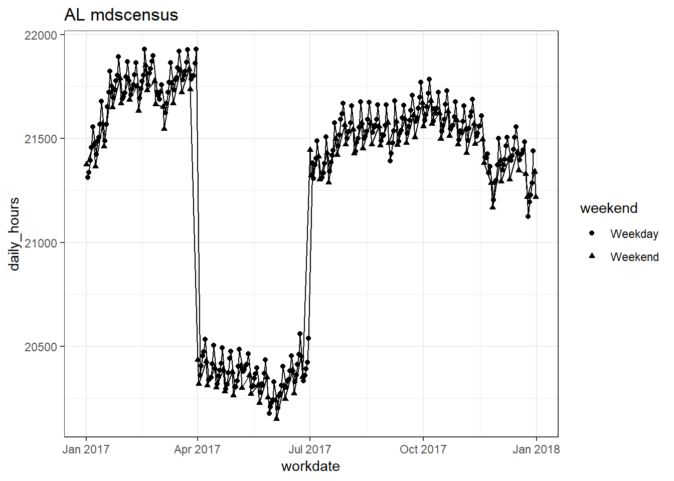
##
## [[33]]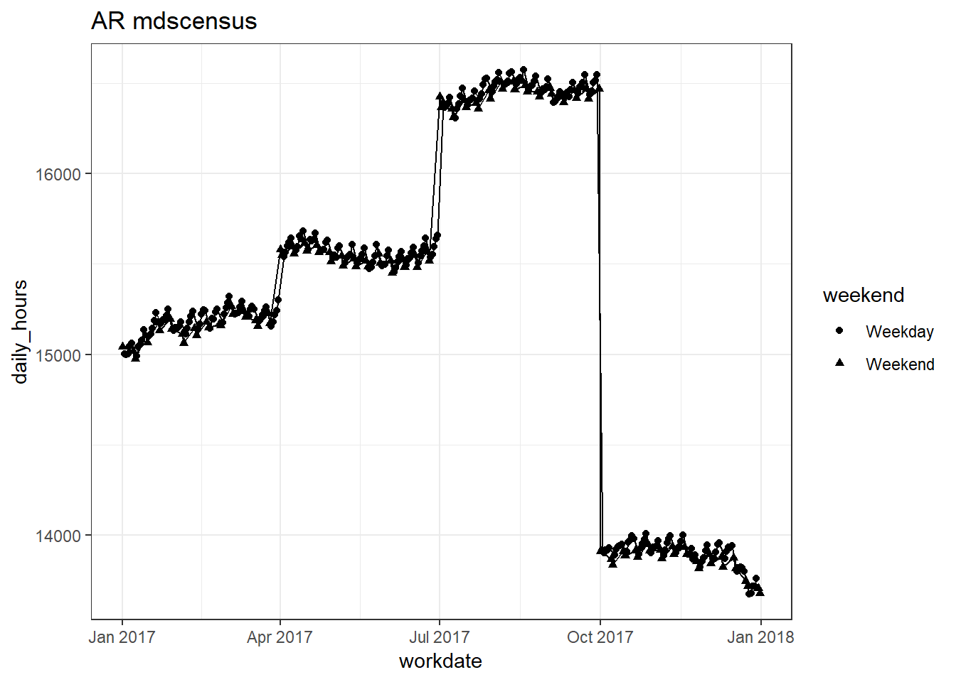
##
## [[34]]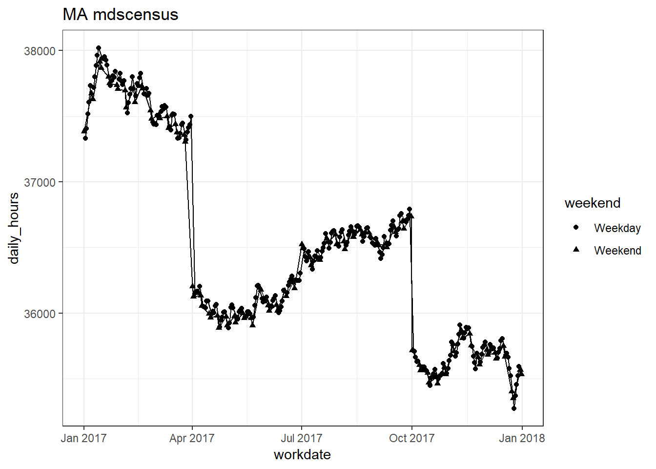
##
## [[35]]